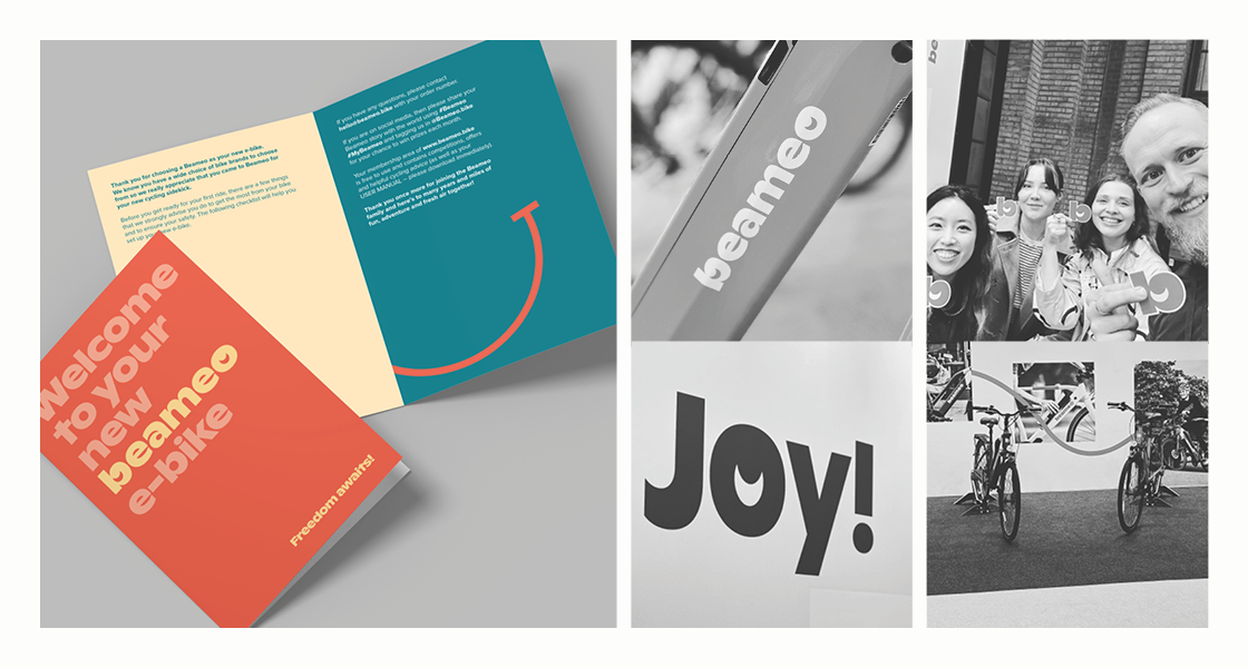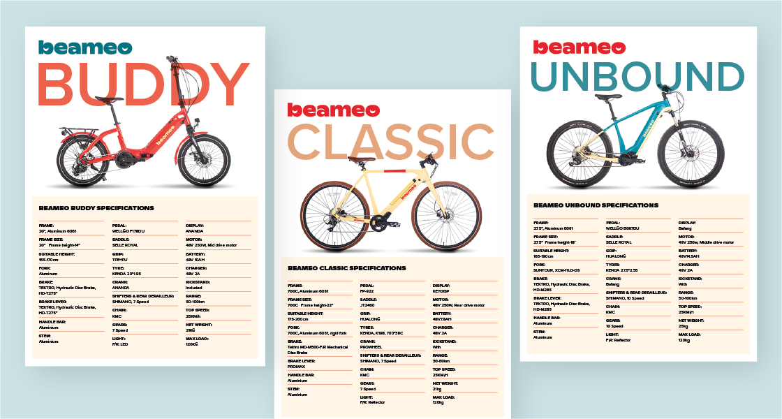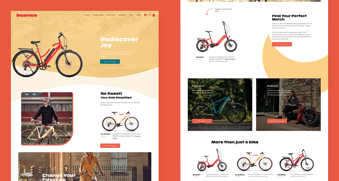
Beameo, a dynamic start-up, approached us with an ambitious vision to carve a unique niche in the competitive UK ‘e-bike’ market. Their goal was to transcend the conventional perception of e-bikes, infusing the experiences of joy, the thrill of adventure, and redefining the role of e-bikes in daily commuting, exercise, and exploration.
Strategic Approach
Our strategy was centered around the core values of fun, joy, and playfulness, aiming to create a brand that not only resonated with a wide audience but also exuded an approachable yet polished vibe. We sought to position Beameo as a brand that could seamlessly integrate with the lifestyle associated with e-bikes, catering to a diverse market in terms of products and price ranges.
Typefaces
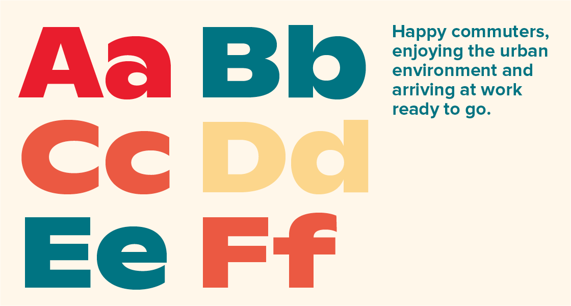
To capture the essence of fun and distinctiveness, we opted for the lively typeface, Ginto Nord, for the logomark and headline font. This choice, with its bold and optimistic feel, allowed us to craft a playful brand image. A unique touch was added by customizing the typeface, incorporating a crescent moon to form a cheerful and distinctive logo-mark.
As a deliberate contrast, we employed the widely acclaimed Proxima Nova for subheadings and body copy, emphasizing the uniqueness of headline fonts and graphic elements.

Colour
Our color palette played a pivotal role in reinforcing the brand strategy. Vibrant warm tones, presented in softer tints, coupled with an earthy forest green, were chosen to evoke a cohesive brand identity. This amalgamation aimed to capture the joyous, lighthearted, and adventurous spirit of Beameo, providing a visually appealing and emotionally resonant connection with the target audience.

In summary, our approach seamlessly merged design elements and strategic thinking, resulting in a brand that not only stands out in the competitive e-bike market but also embodies the essence of joy, adventure, and approachability.